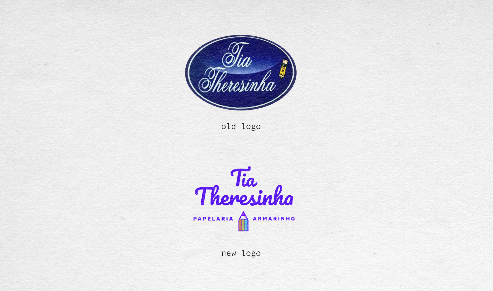
Rebrand logo
Tia Theresinha Papelaria e Armarinho
The main goal of the brand's visual change was to update the store's image, ensuring it appeared more contemporary without losing the warm and personal character that the name "Tia Theresinha" and the combination of "Stationery and Haberdashery" (Papelaria e Armarinho) have already established.
To achieve this, the pencil was selected as the central icon, as it universally symbolizes inspiration, education, and the act of creation—essential foundations for the stationery business. The choice of a vibrant color palette consisting of Purple, Blue, and Orange serves to infuse the brand with a feeling of vitality and optimism.
Ultimately, this modern design successfully connects the store’s historical tradition of service with a forward-looking, engaging aesthetic. This effectively positions Tia Theresinha as a dynamic source for both creative supplies and essential domestic items.

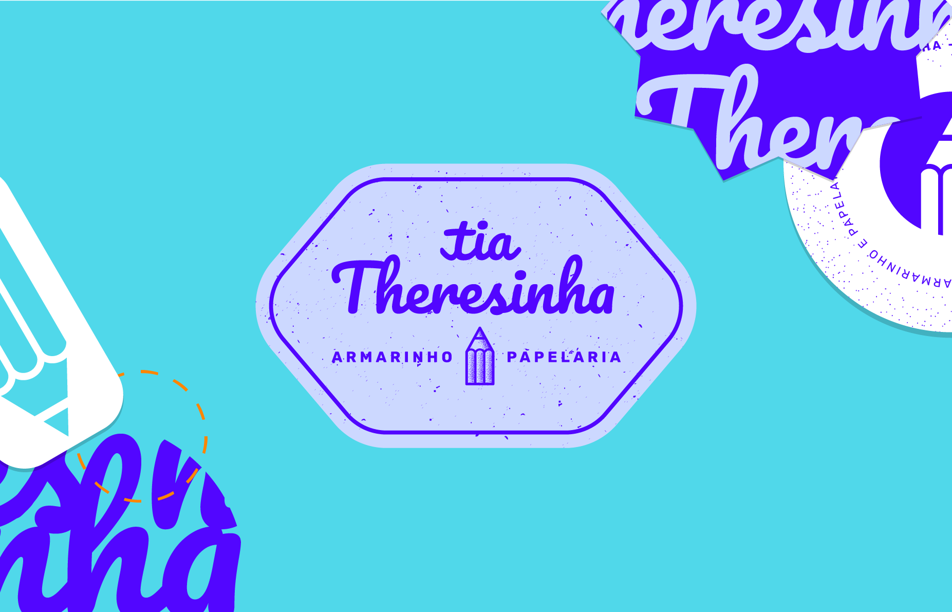
Stickers

Pattern Design
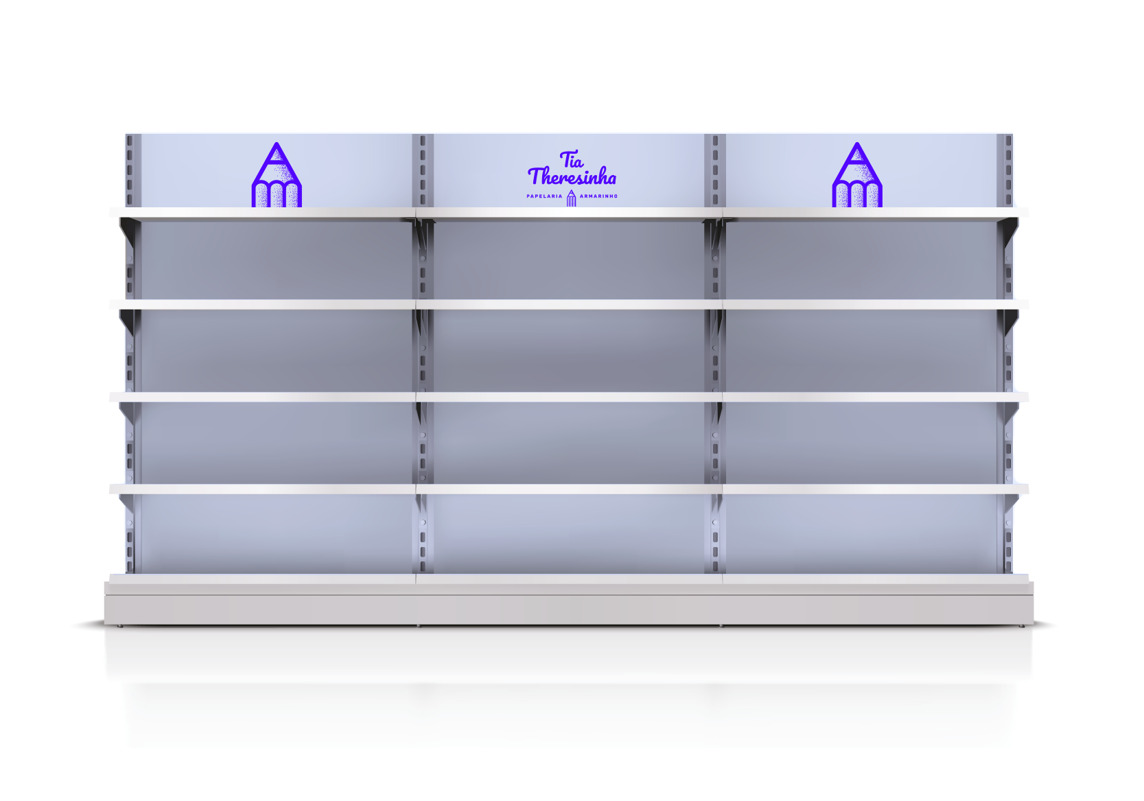
Store Display

Business card
Logos

Packaging
Logo Drafts