Amor in Cake Brand
A CONFEITARIA MAIS ROSA DA CIDADE
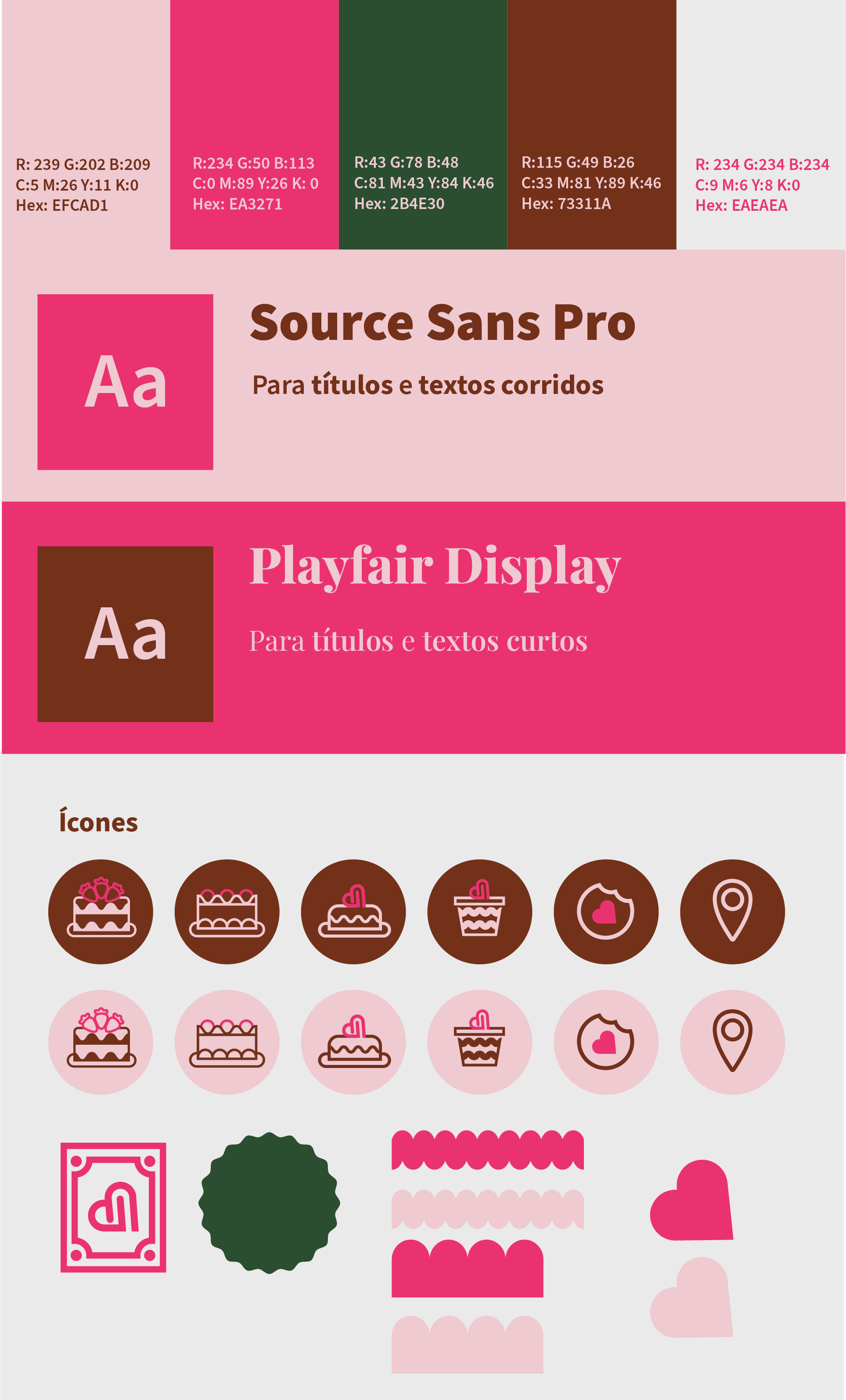
The design objective is a logo that is both charming and memorable, using the heart as a core element to communicate the joy and dedication behind their signature pink treats, establishing the brand as the standard for confectionery love.
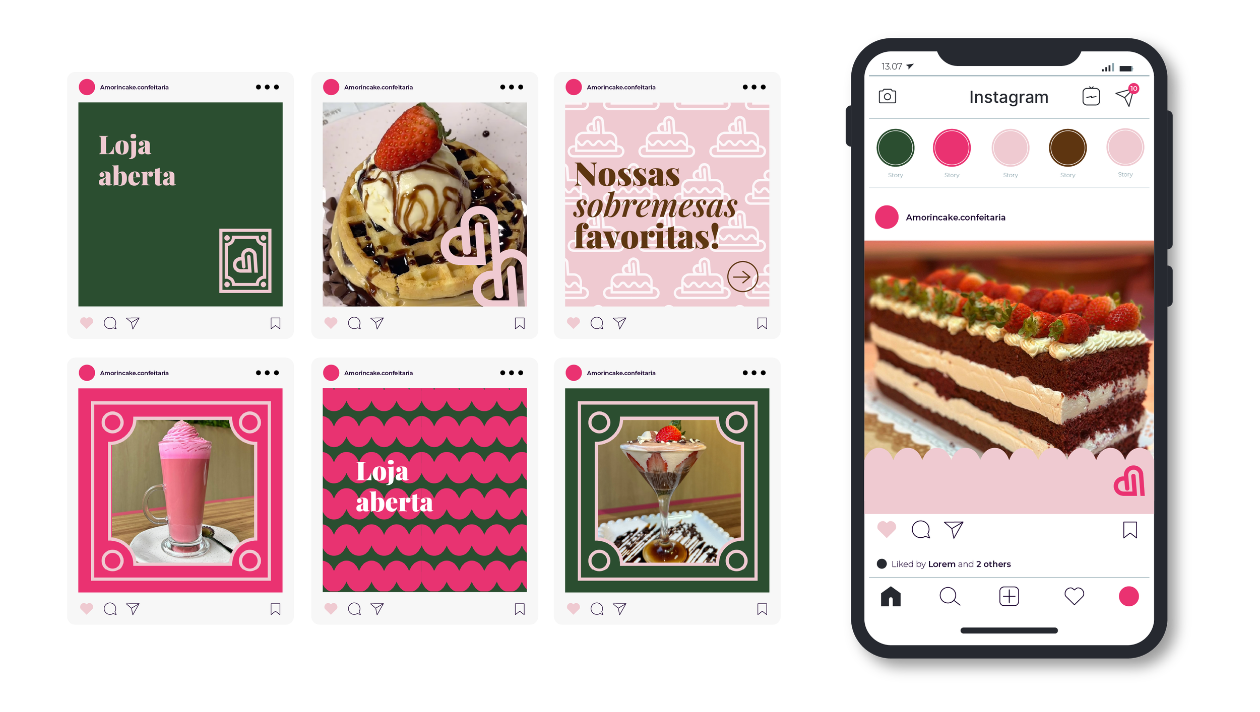
To achieve an elegant aesthetic, the design incorporates the color green. The visual identity also includes a variety of icons representing their cakes and sweets. Furthermore, the entire brand identity is designed to reference the highly iconic façade of their location in the city of Santa Teresa, in the interior of the state of Espírito Santo, Brazil.
THE MOST PINK BAKERY IN TOWN